2022 Wedding Trends: Wedding Stationery
March 22, 2022
Recently, we did a styled shoot incorporating all of the best wedding trends we think you’ll see in 2022. We worked with some amazing vendors to put this all together, and we’re so proud of how everything came out. We’ve already broken down the bouquets, dresses, tablescapes, and cakes. Finally, we’re doing wedding stationery! Adair Creative Studio did the stationery for this shoot, and their work was so beautiful. We asked the owner, Hannah, for her thoughts on the stationery she designed, and we wanted to share!
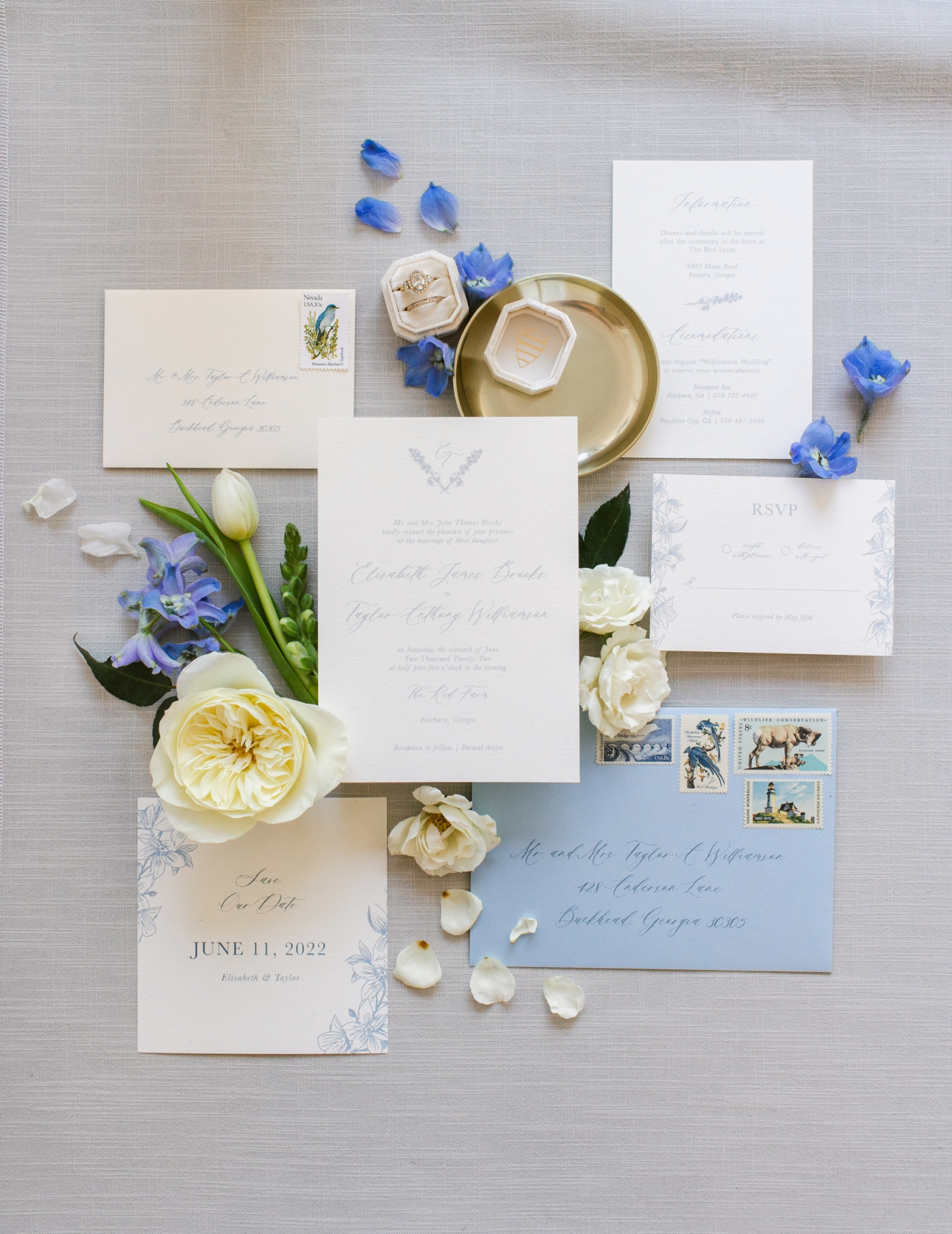
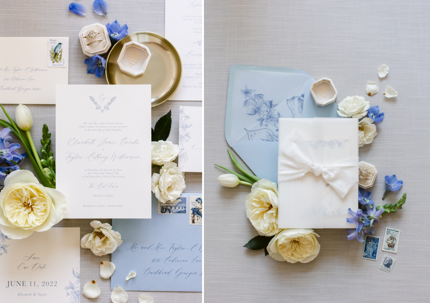
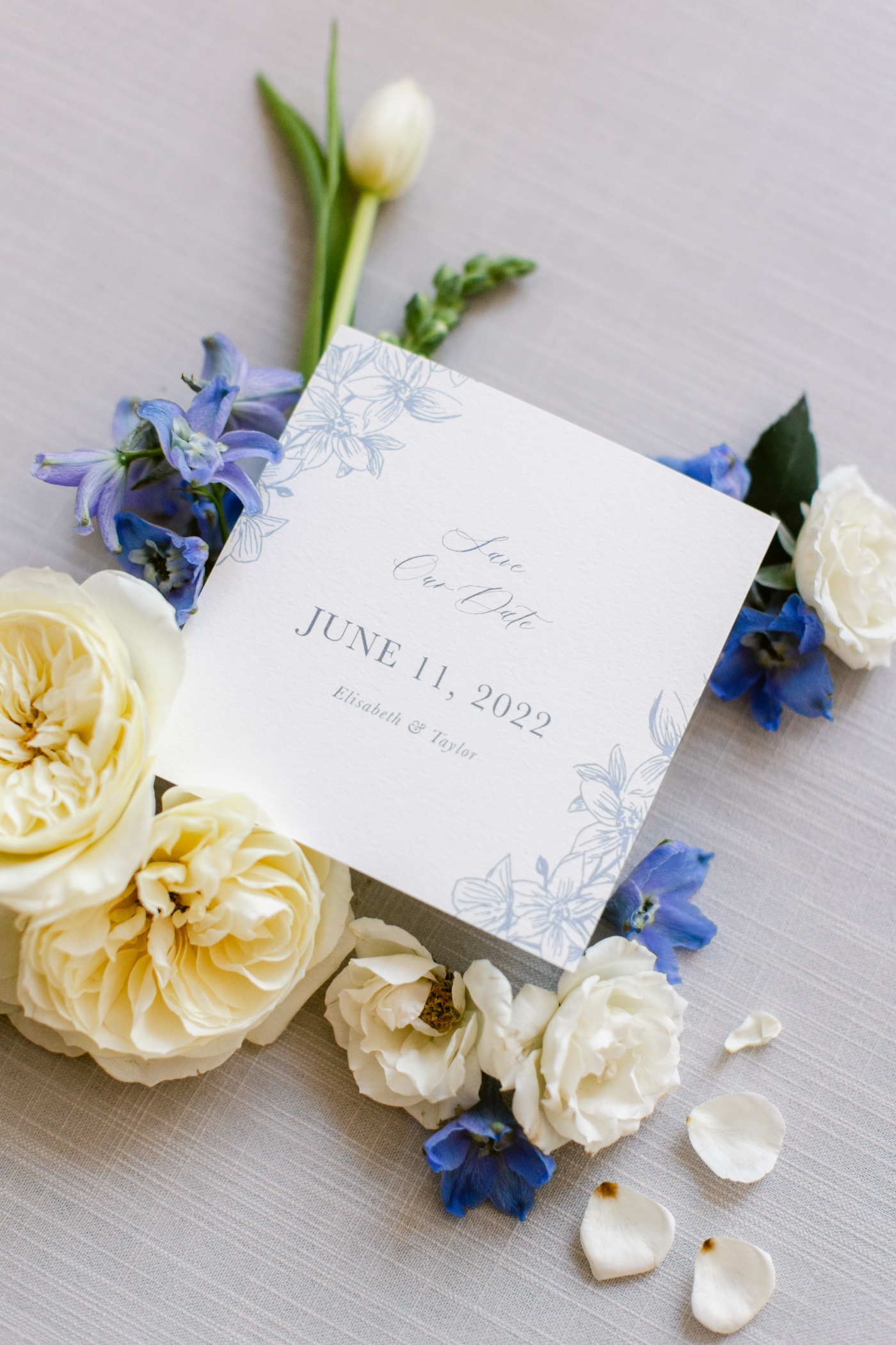
Classic
While I believe the classics will never go out of style, as they’re traditional, there are always ways to make it unique and incorporate trends. I used a timeless dusty blue color to make this suite big and also incorporated a couple of other shades of blue throughout other design elements to have a monochromatic suite. The monochrome keeps things simple and classic while also adding depth to the theme. I incorporated vellum, currently a hot trend, but also what I believe is becoming a staple in wedding stationery, and tied it off with a hand-dyed silk ribbon.
Romantic
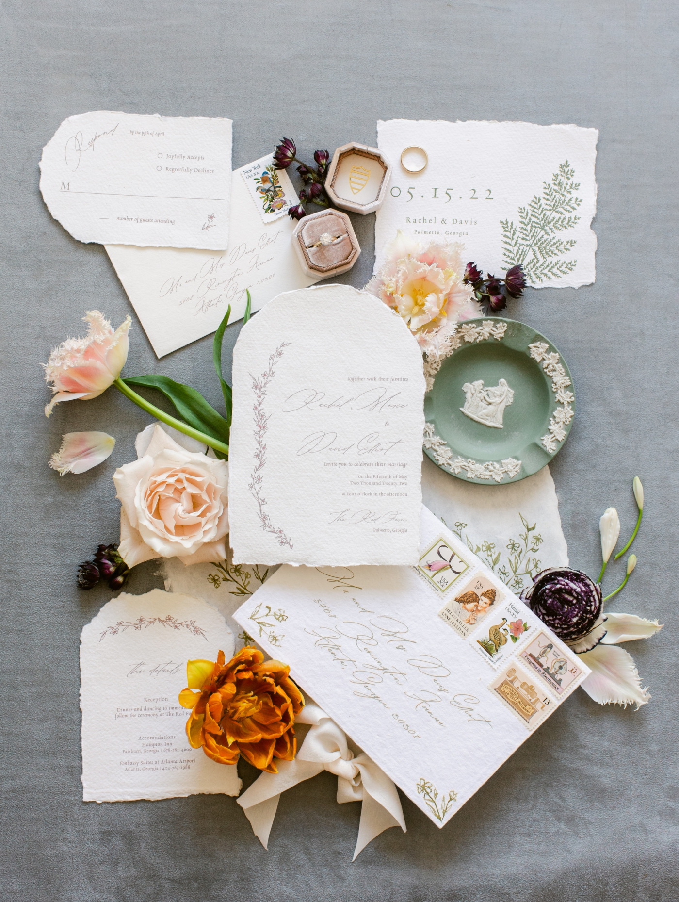
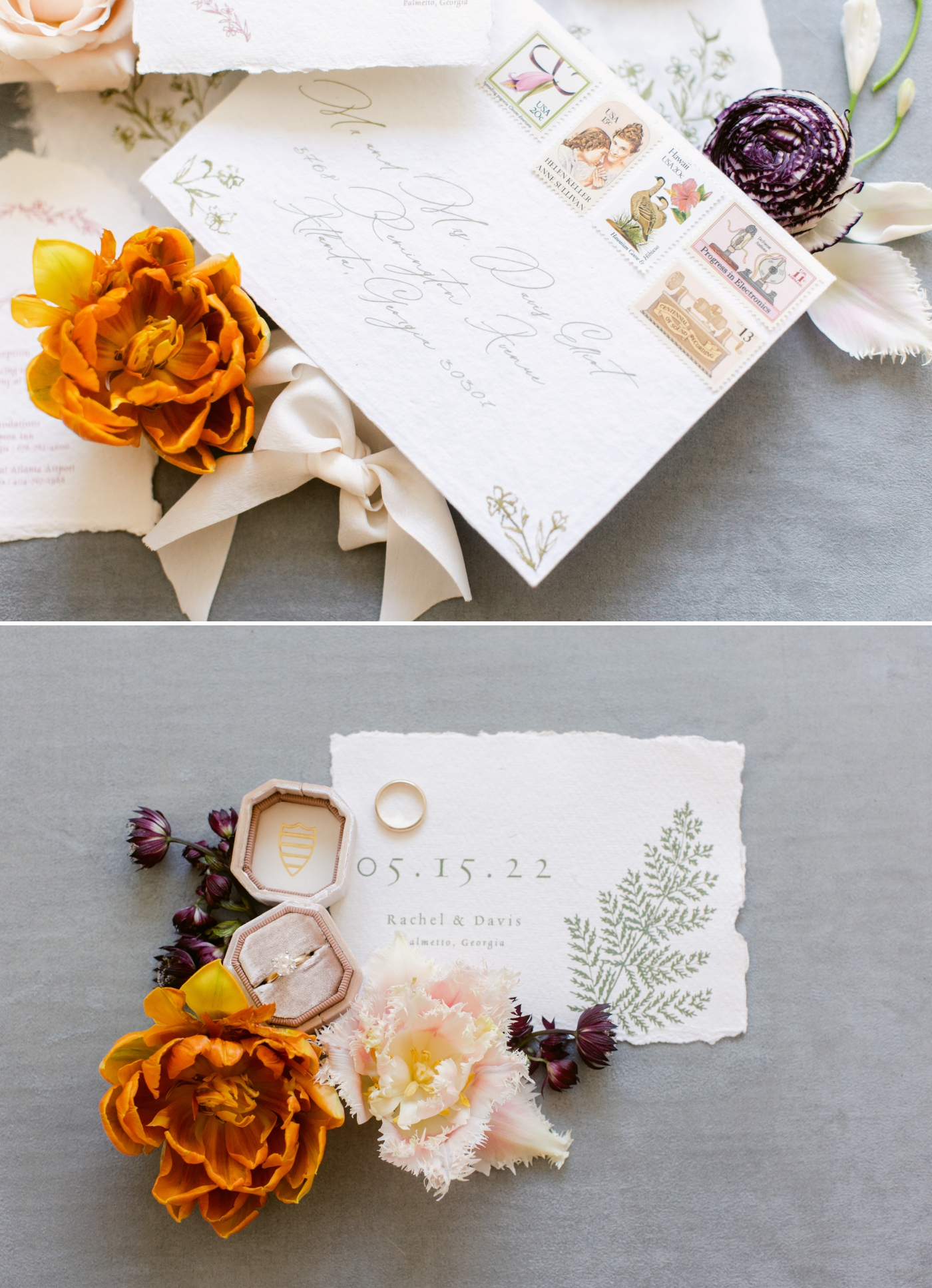
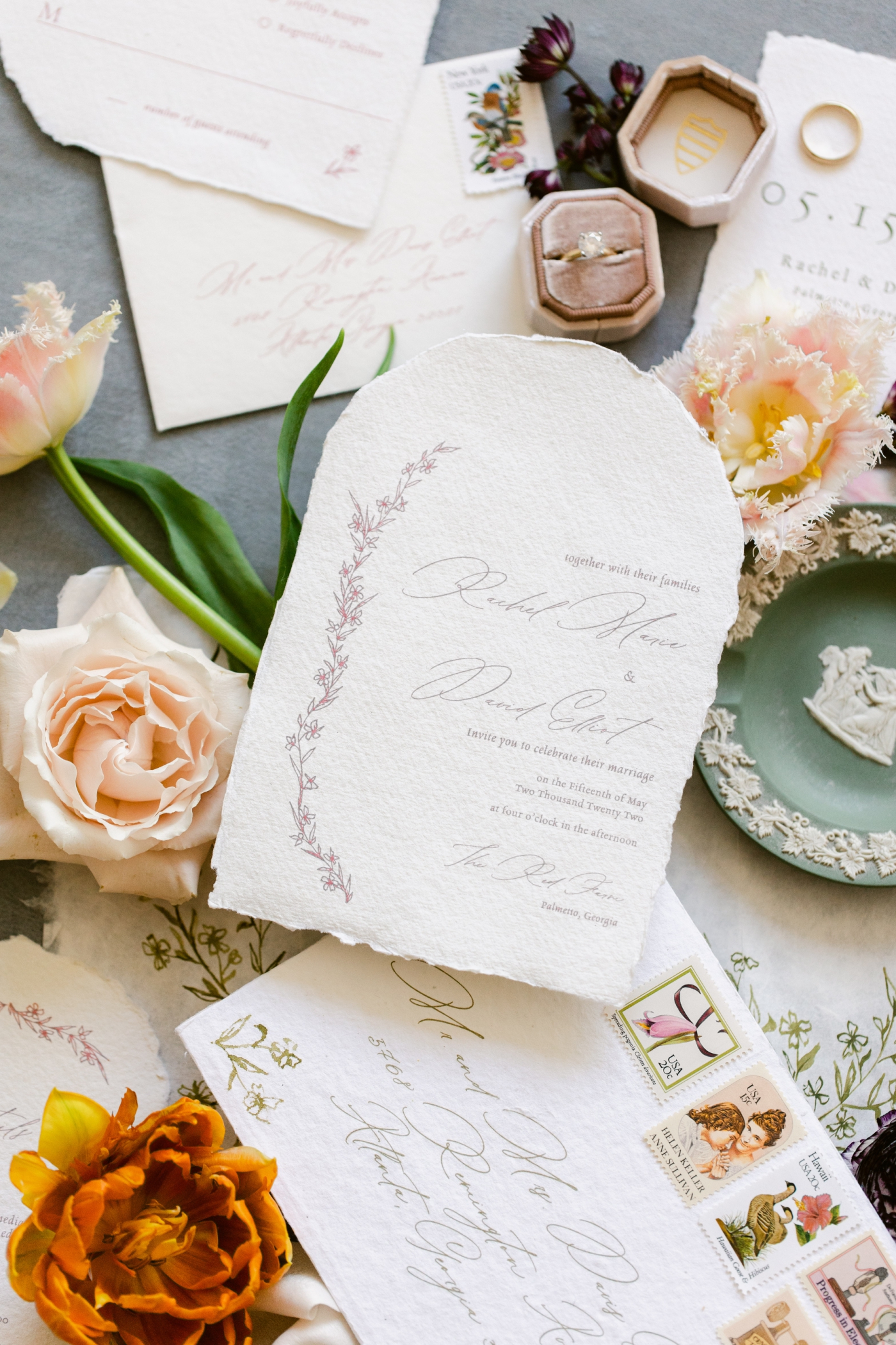
When it comes to wedding stationery, shapes are in. I’m beginning to see many uses of arches, angles, and various unique cuts in the use of invitation suites. I incorporated this trend using arches for the romantic suite, specifically on handmade paper for a softer edge. I used a bright pink and green in this suite to contrast and bring a pop of color to what is typically a soft and muted look. Of course, organic sketches of flowers help bring a personalized design element while keeping it simple. My favorite part of this suite is the hand-painted florals on the handmade gate card. It adds a touch of elegance and personality to the overall look of the suite. These are the elements that really take invitations to the next level and make guests feel appreciated upon receiving them.
Modern Minimalist (Contemporary)
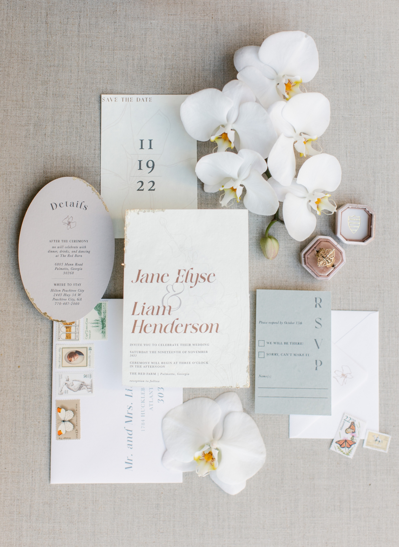
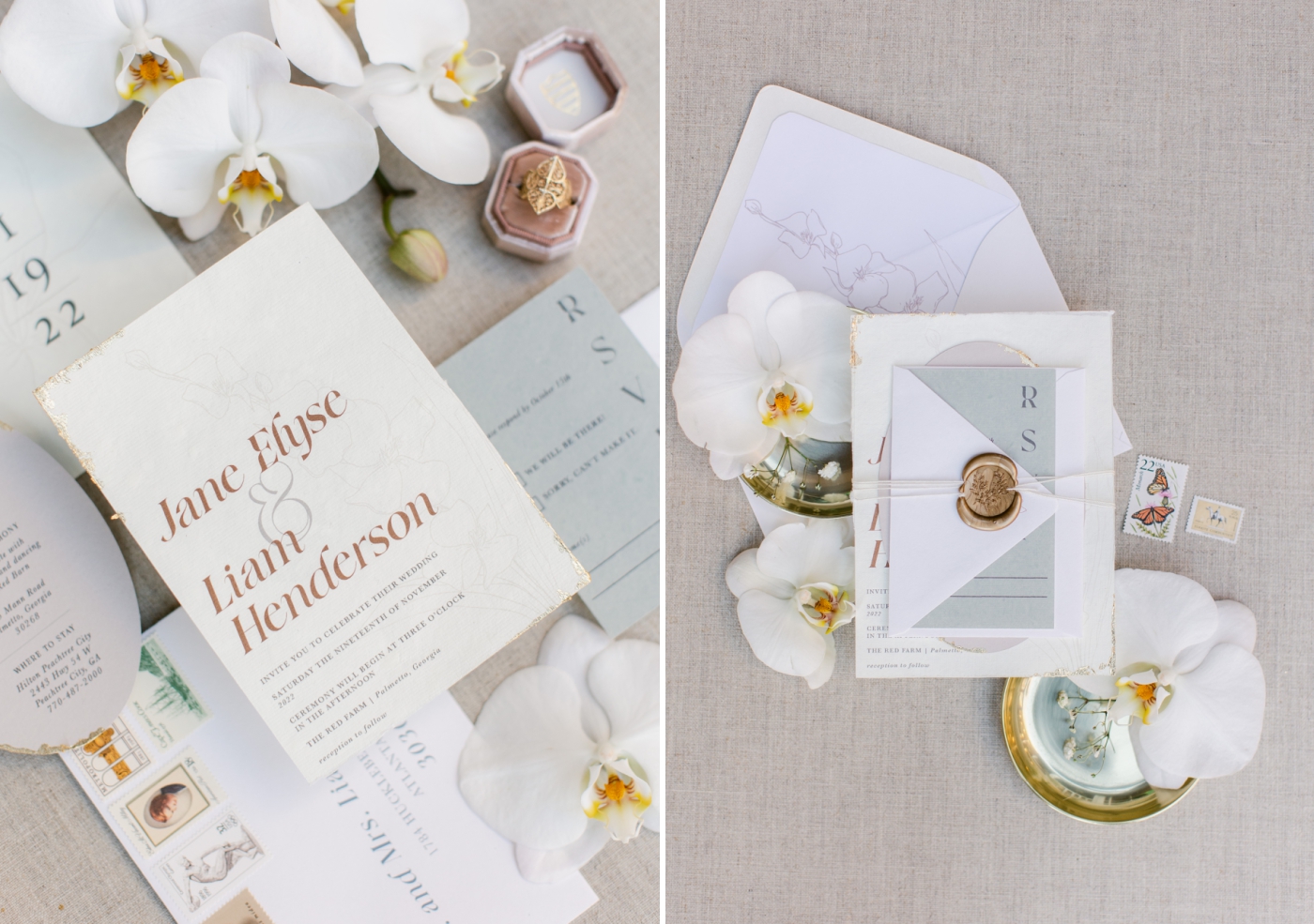
The contemporary suite packed a punch of personality with the use of small consistent elements. I used a muted color palette with various tones that offered contrast while including cohesive elements. The orchid was an important flower in this wedding theme, so I utilized an orchid sketch throughout the suite. It showed up on the save the date, invitation card, details card, and the envelopes.
The contemporary theme ditched the classic calligraphy and script fonts, and instead uses a bold and unique serif. Fonts can really make or break a suite, and if you’re attempting to break tradition, you can never go wrong with picking a trendy font with some character. One last design element I used in this suite that is beginning to gain popularity is gold leaf edges. Gold leaf elevates the suite by adding a touch of luxury but is so delicate that it can feel casual and organic at the same time.
Earth Tones (Sustainable)
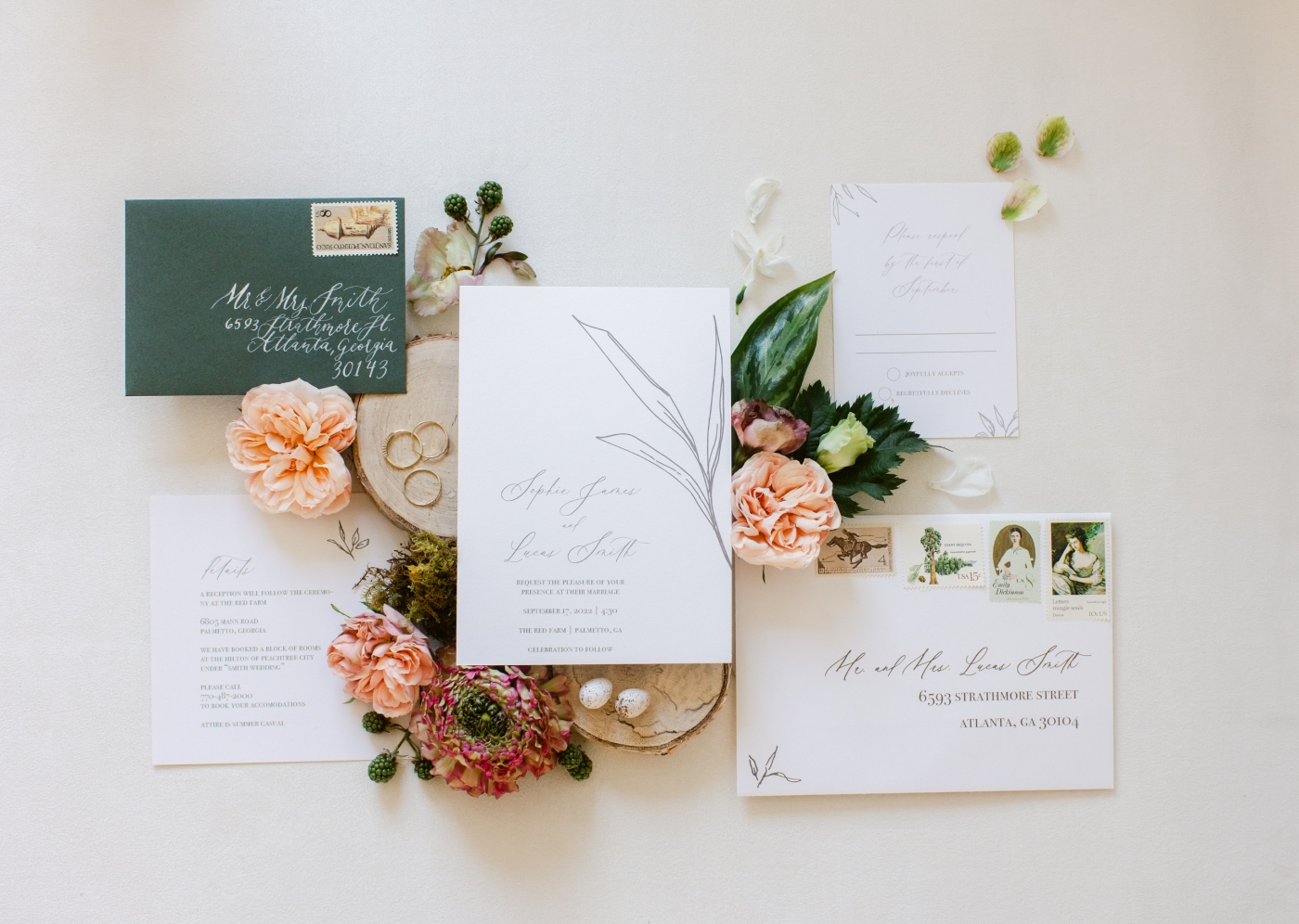
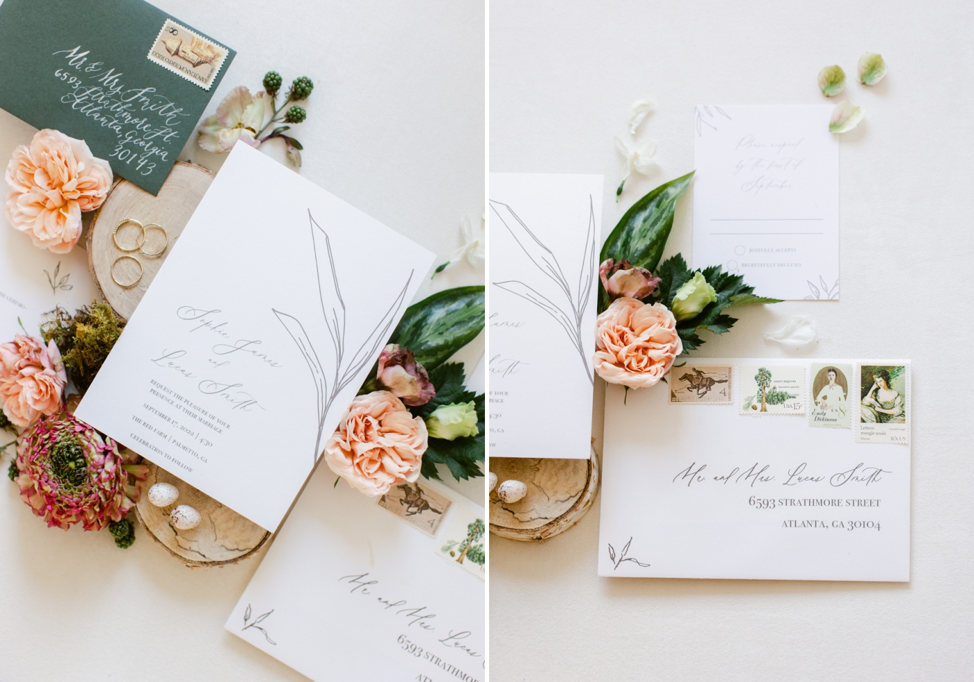
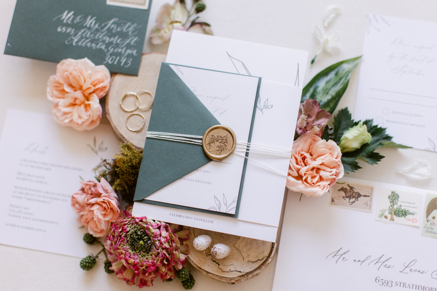
Quite possibly my favorite suite, the sustainable suite says eco friendly is back! Who says you can’t have paper goods that aren’t good for the environment? While I hope that all custom wedding invitations make a good enough impression to land a permanent spot on the fridge, there are so many ways now to utilize elements in wedding stationery that are good for the environment. Some options include handmade paper or recycled card stock, and even paper that have seeds in them and can literally be returned to the earth to grow plants. I also incorporated simple, organic sketches and a very natural color palette in this suite. To add texture in what is such a down-to-earth design, I used natural twine around the suite. Other examples would be handmade paper, botanical elements, or letterpress/embossing.
Whimsical
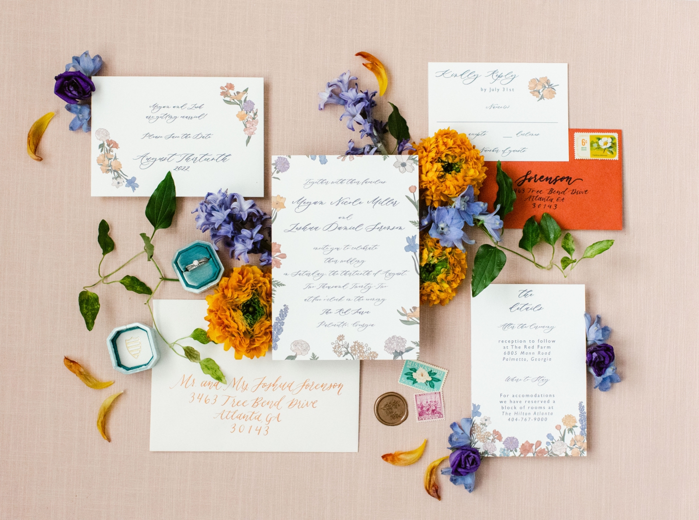
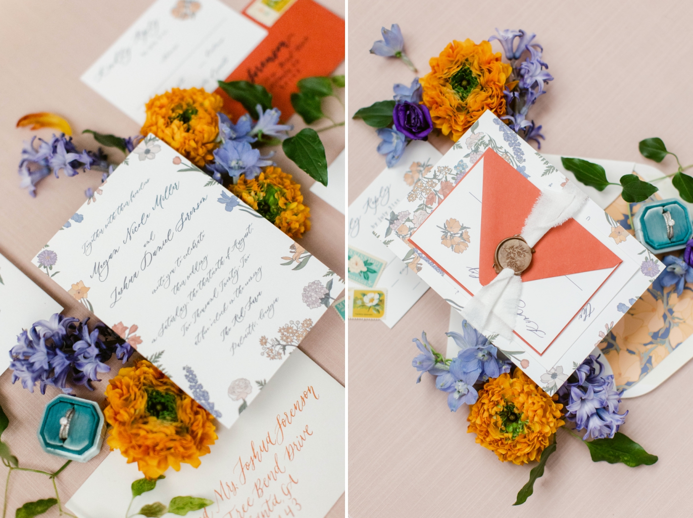
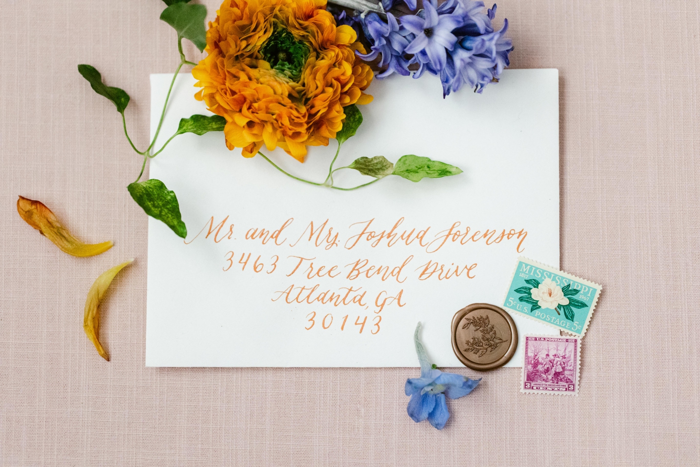
The whimsical suite incorporates one of the biggest design trends, color! We are over the phase of couples utilizing one or two wedding colors, and instead using a palette full of them! I love this suite because it is full of personality and bold colors and can be altered in a number of ways to be unique to the couple. This is the kind of suite where you can add just about any trend you like, such as gold foil, hand-painted edges, custom paintings, bold patterns, and trendy fonts. The opportunities are truly endless. I loved the use of calligraphy in copper ink with matching wax seals. The use of a vellum envelope goes a long way here as well because the design can be seen from the outside which makes a loud statement.
We loved everyone’s work for this styled shoot, and we’re so glad we get to showcase Hannah’s gorgeous wedding stationery!
If you’re planning your own wedding, we’d love to hear from you! It would be great to hear all about your wedding day and learn how we can best capture your day for you!
Vendors:
Venue: Historic Red Farm
Planning & Design: Swanson Signature Events
Florals: Tulips And Twigs
Rentals: Event Works Rentals
Lux Linens: Stradley Davidson
Cakes: Vanilla And The Bean
Stationery: Adair Creative Studio